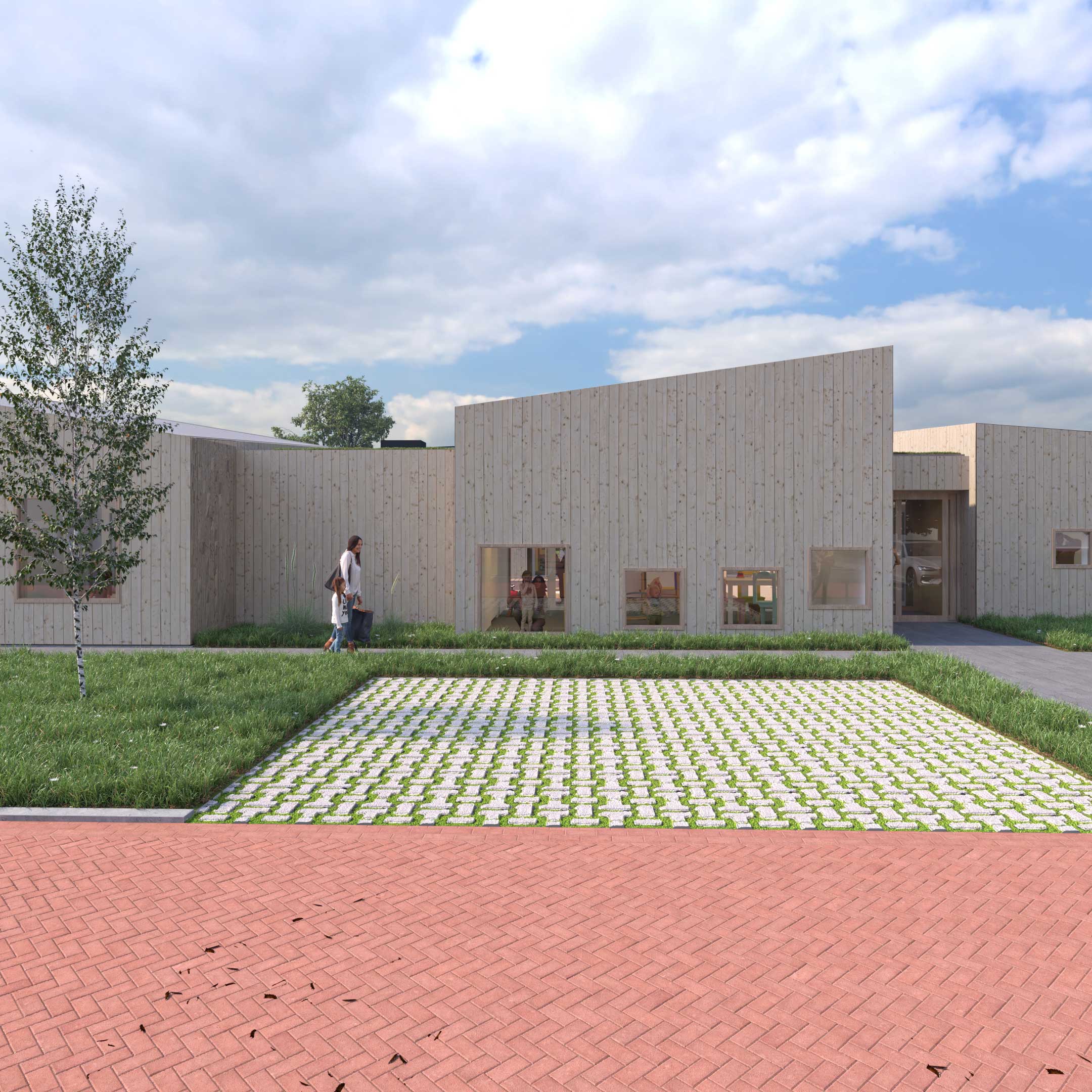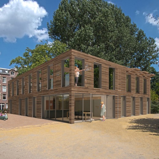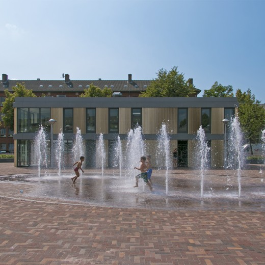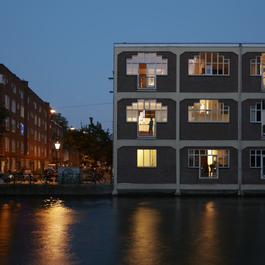
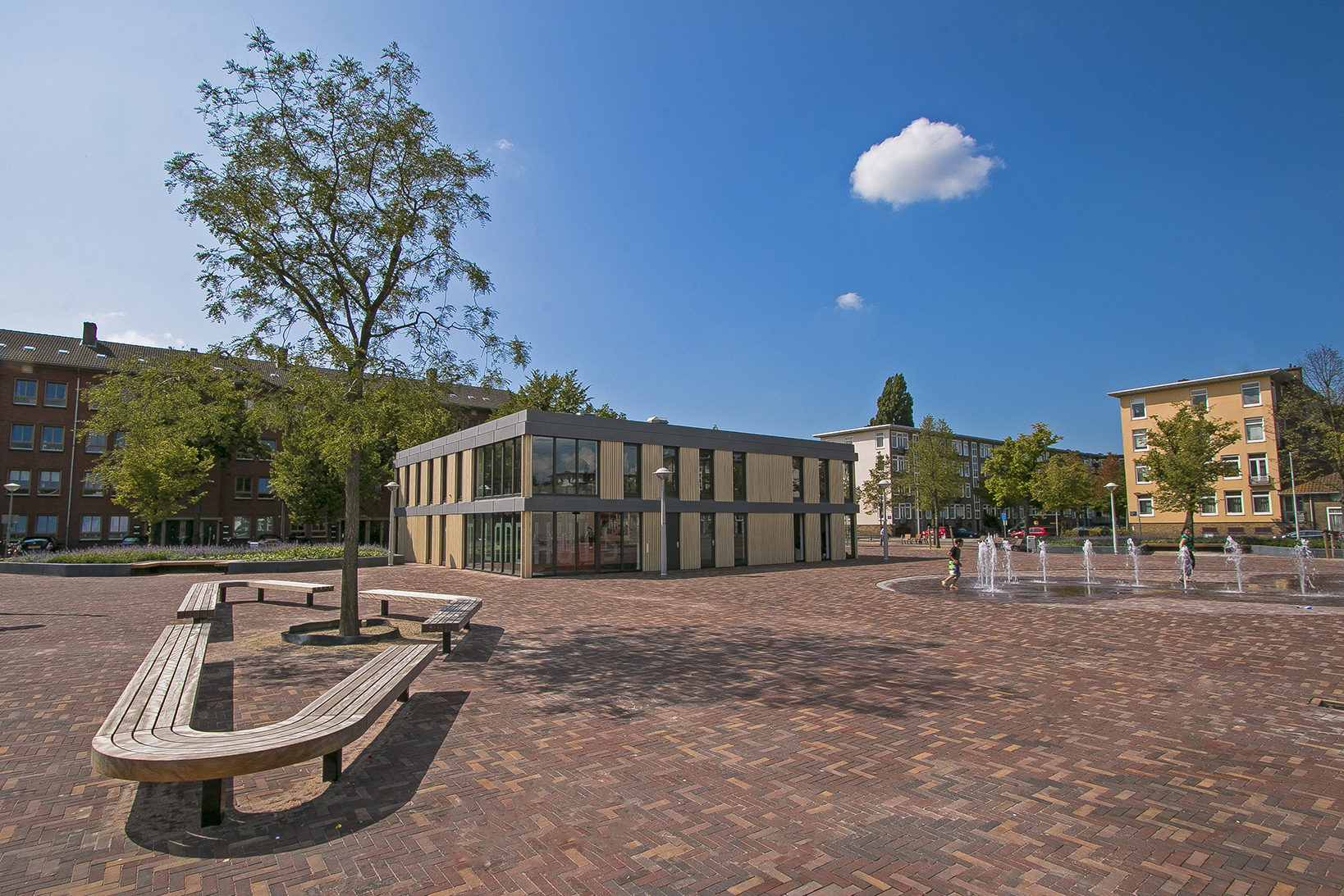
‘t Landhuis
Client
Municipality of Amsterdam
Floor area
550 m² GFA
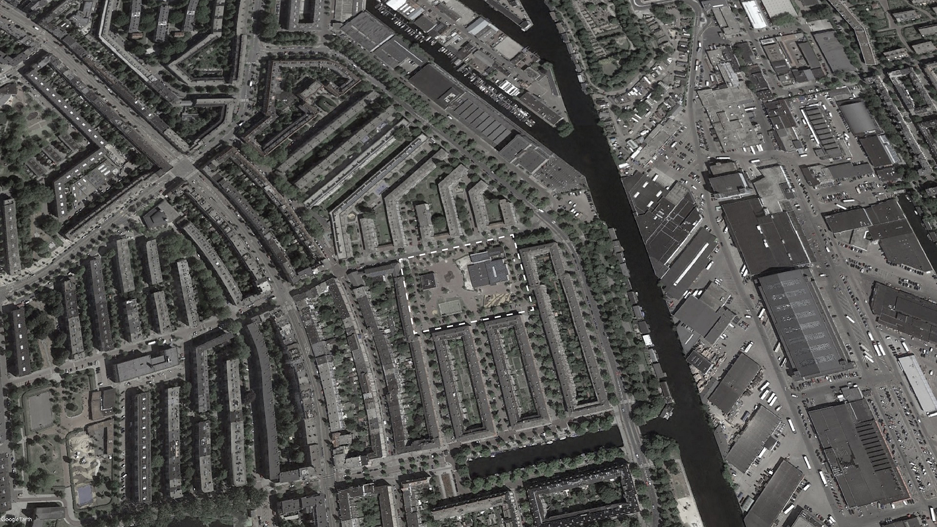
Location
Amsterdam
Purpose
Youth center and after-school childcare
Status
Delivered
Project type
Renovation
Year
2013 – 2014
Assignment
Competition
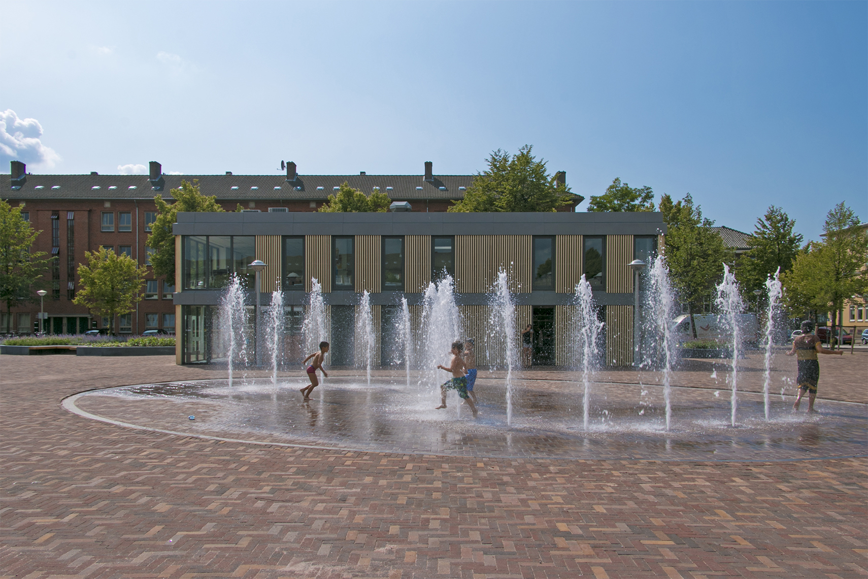
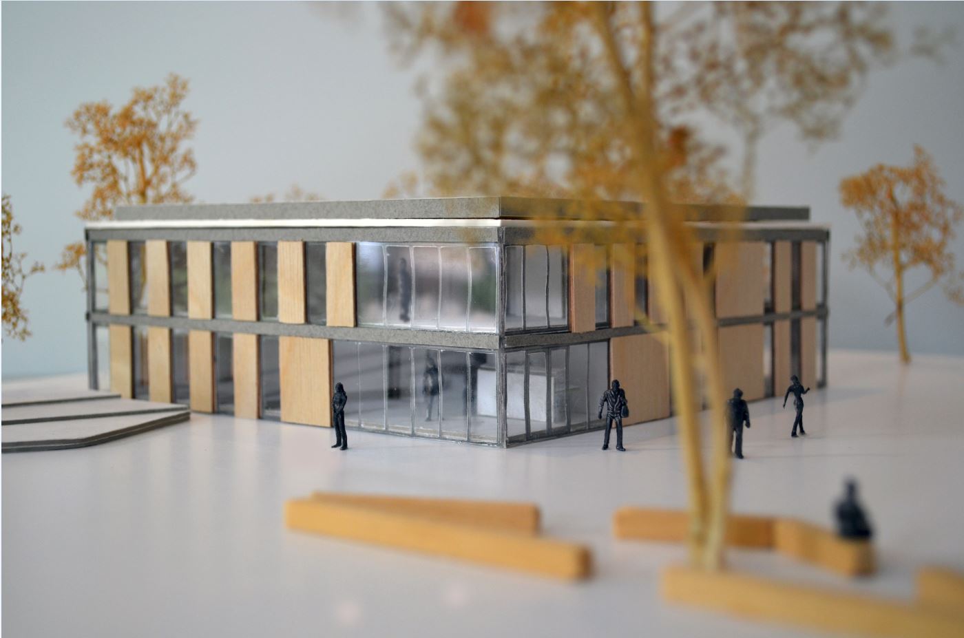
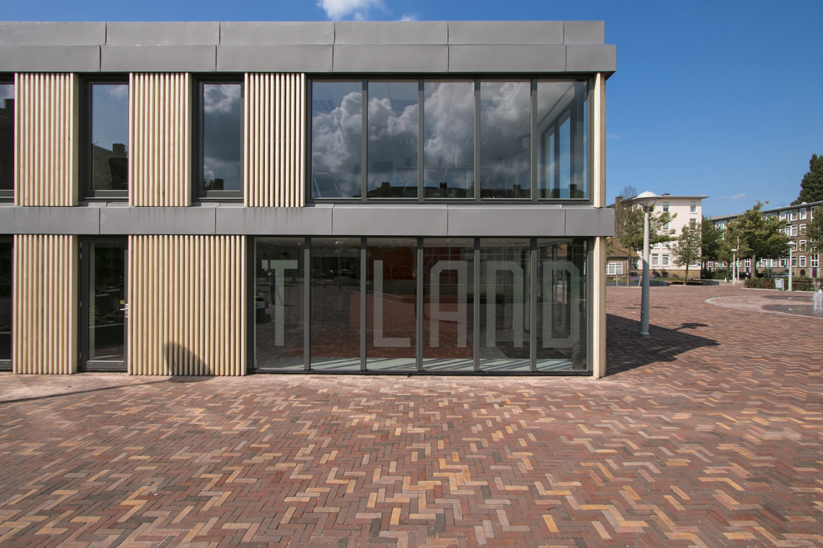
This project was initiated in cooperation with the residents of the Landlust neighborhood. As an alliance, our preliminary design won the competition for the renovation of the existing youth center ‘New Society’. We then worked together with the relevant stakeholders to further develop the design.
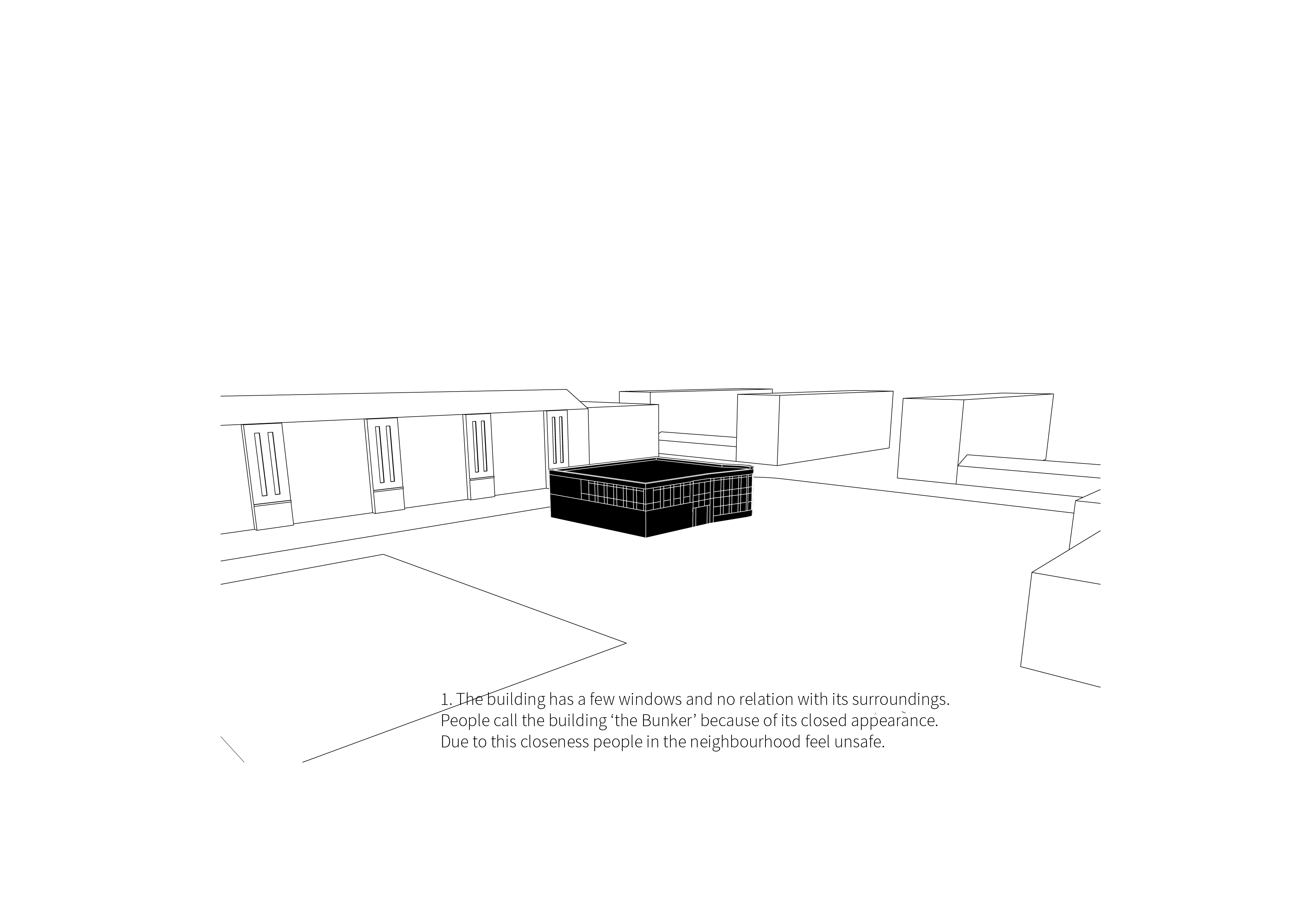
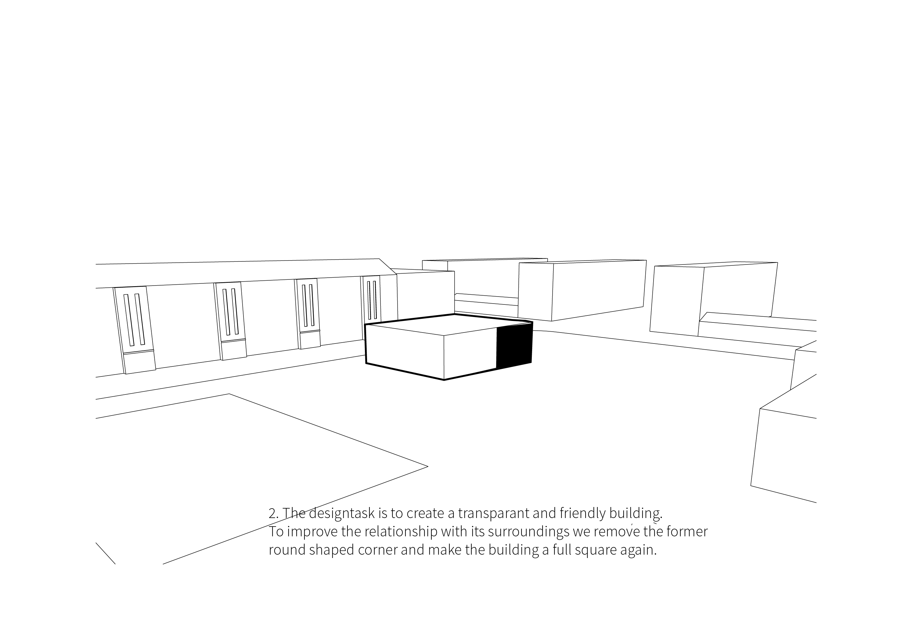
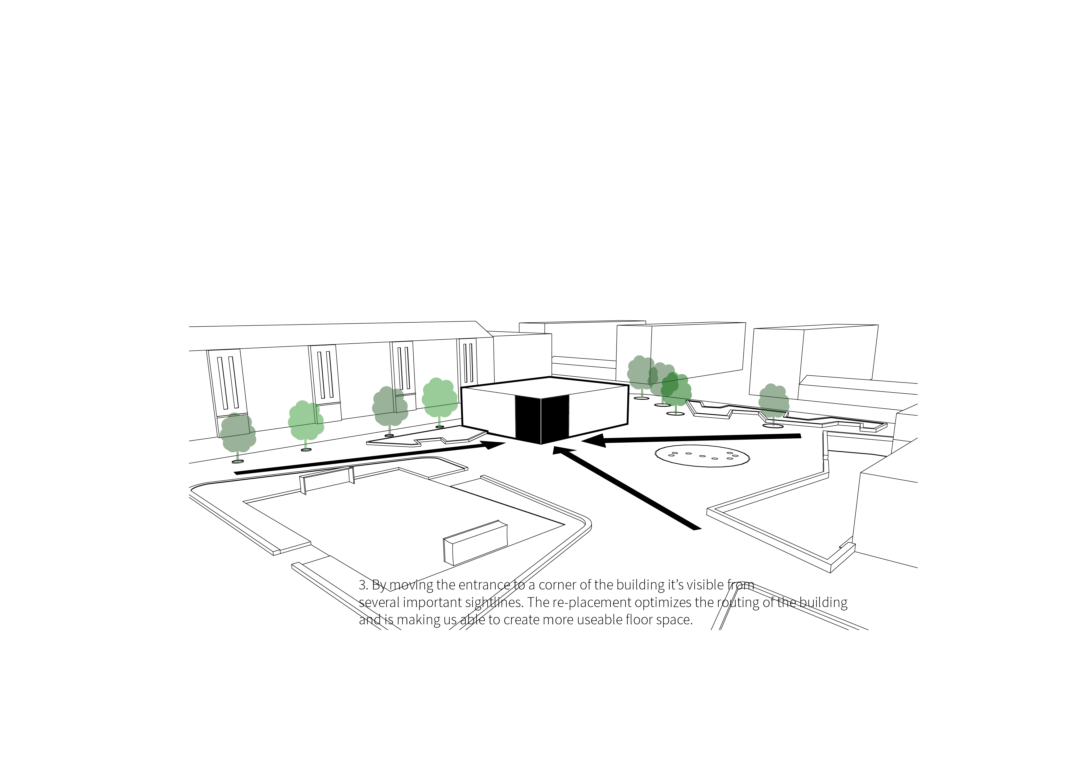
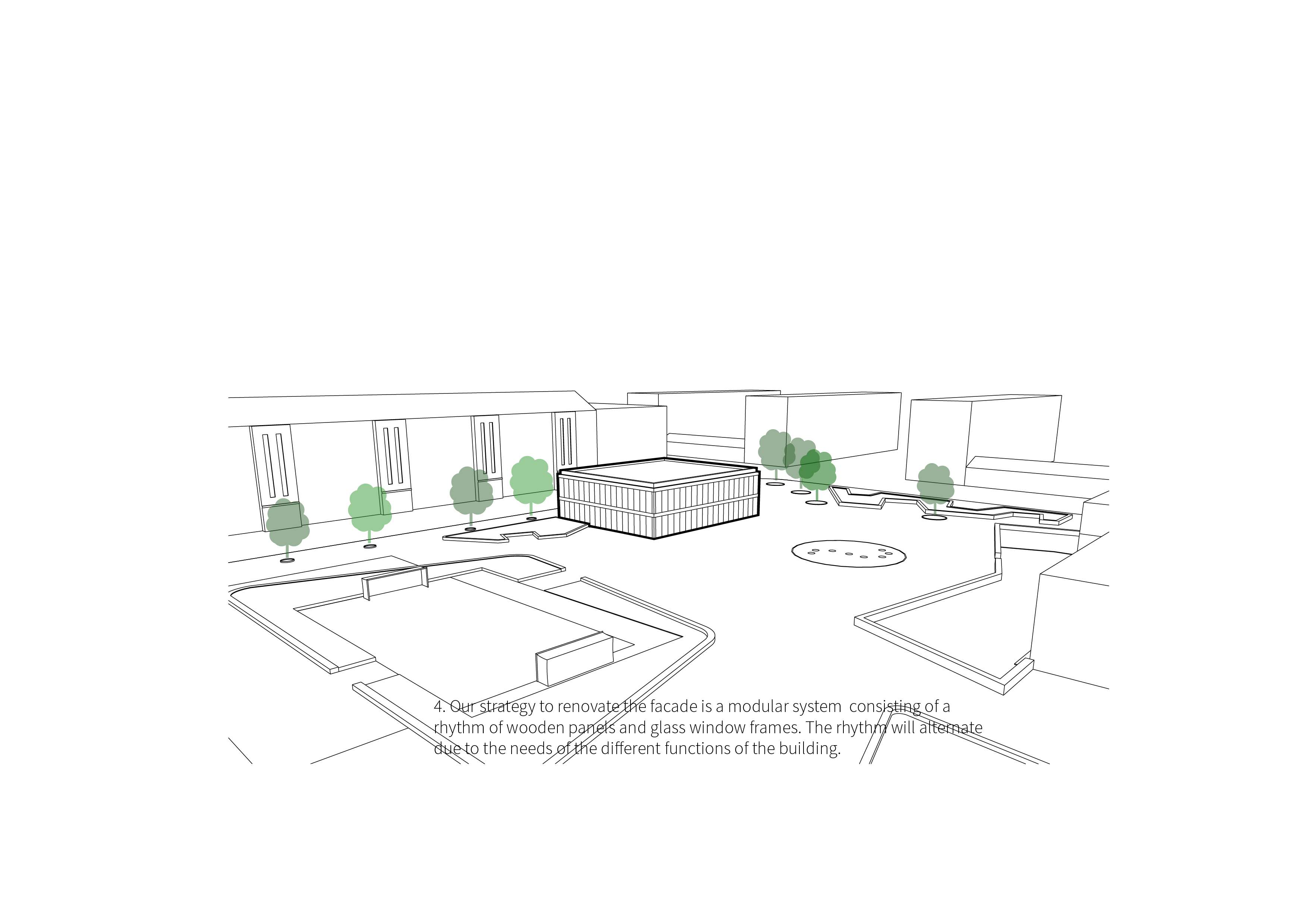
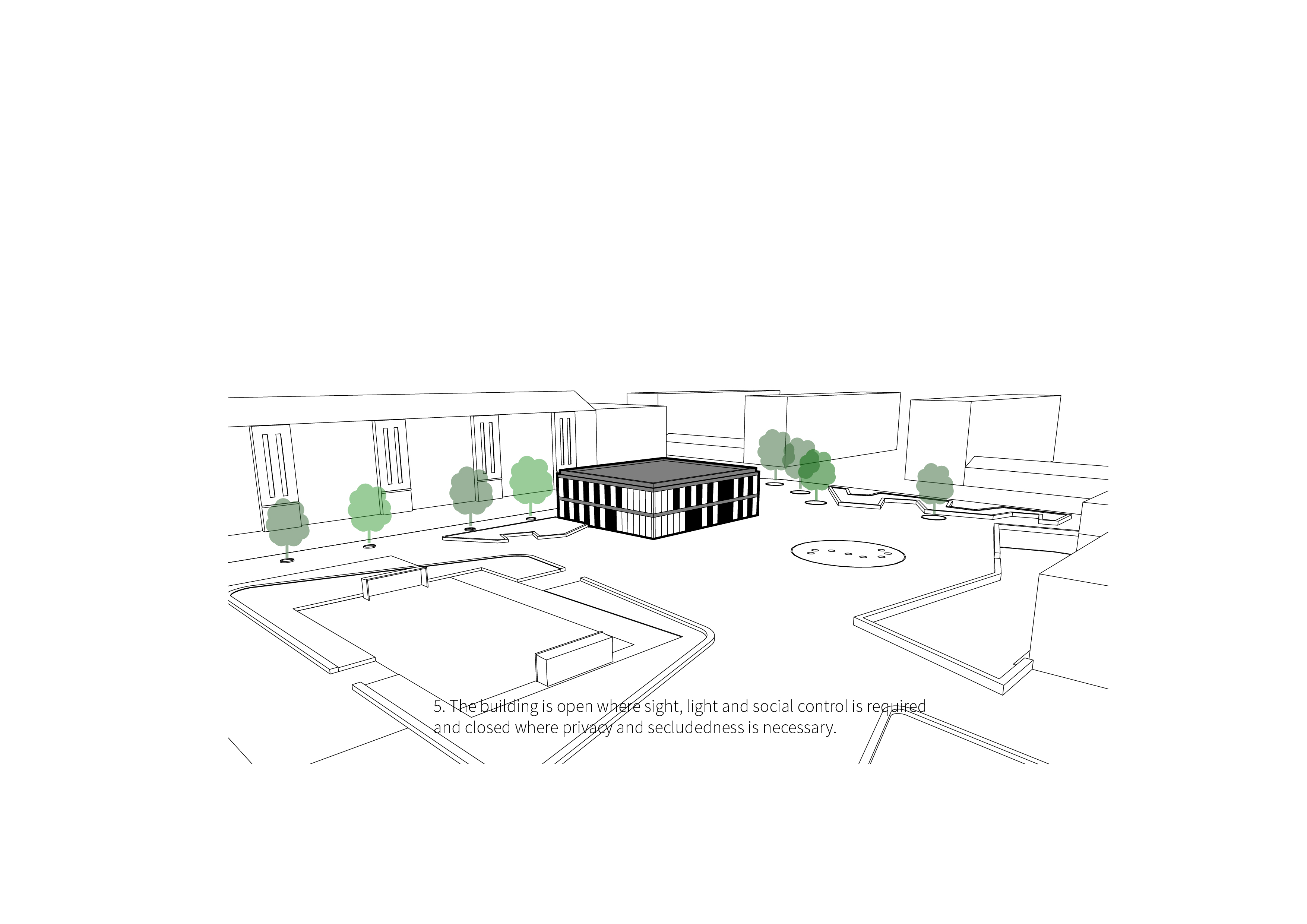
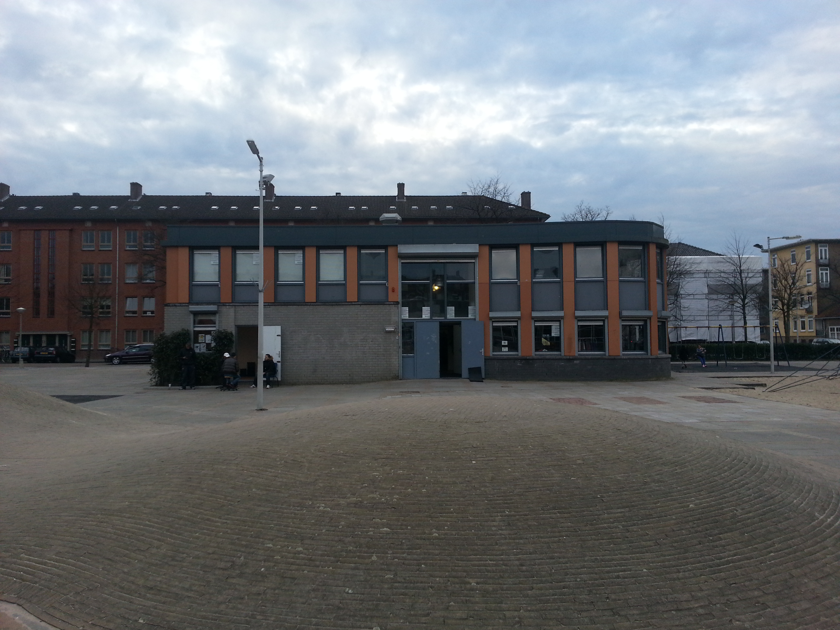
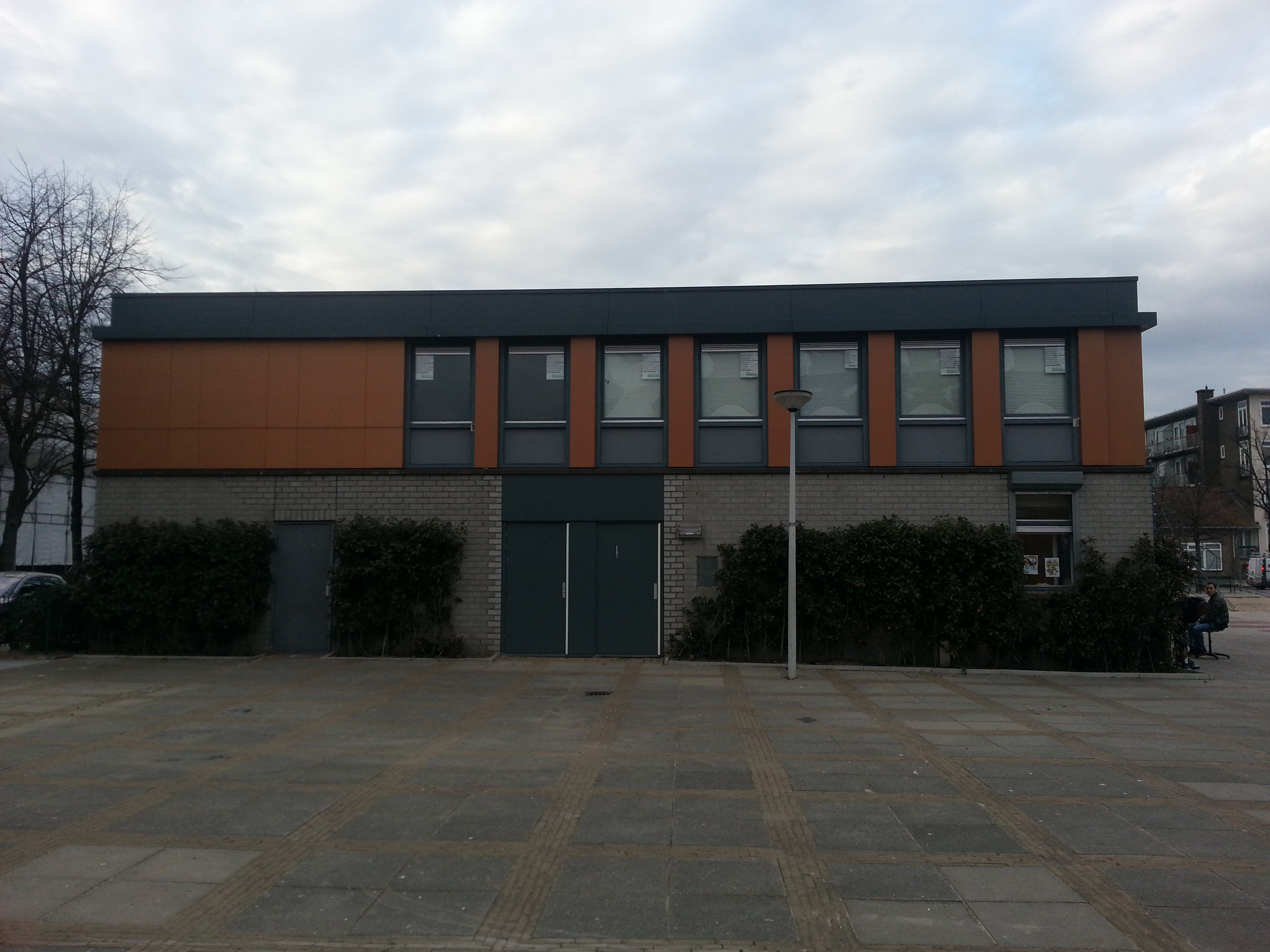
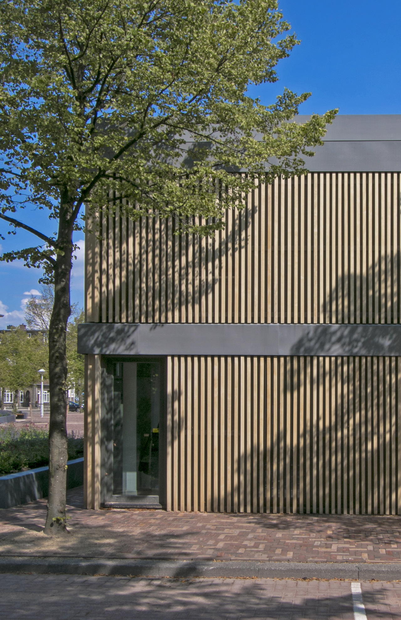
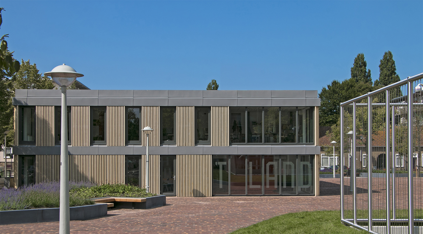
The goal of the renovation was to make the building more transparent and to give it a friendlier, more welcoming look. The existing building was referred to as ‘the bunker’ by members of the community due to its closed-off character. The interior of the building was barely visible from the outside and the visibility in the surrounding square was low, making it an attractive place for loitering by young people, which made the local residents uneasy.
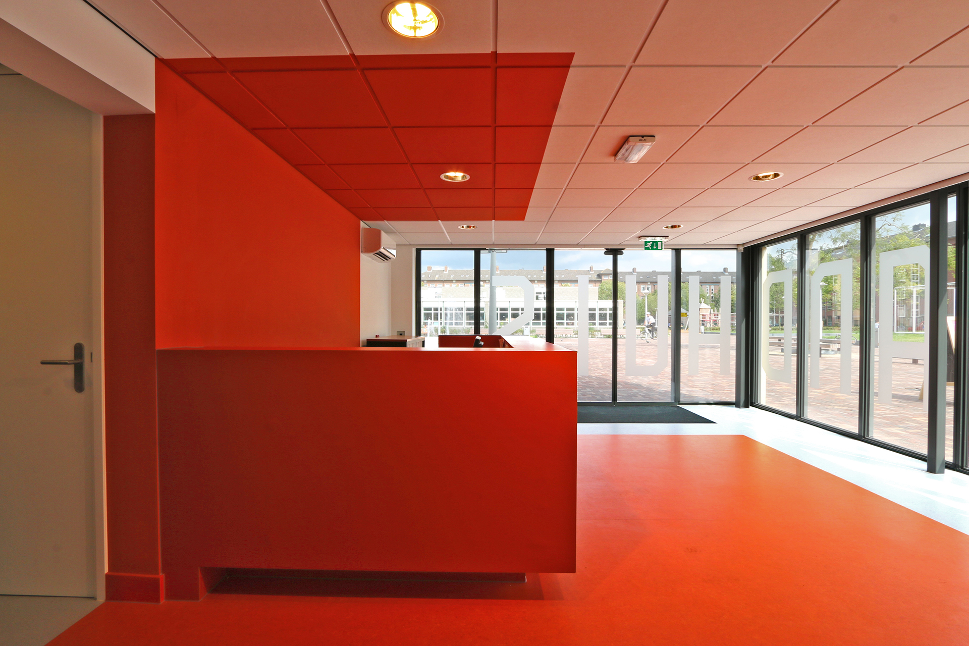
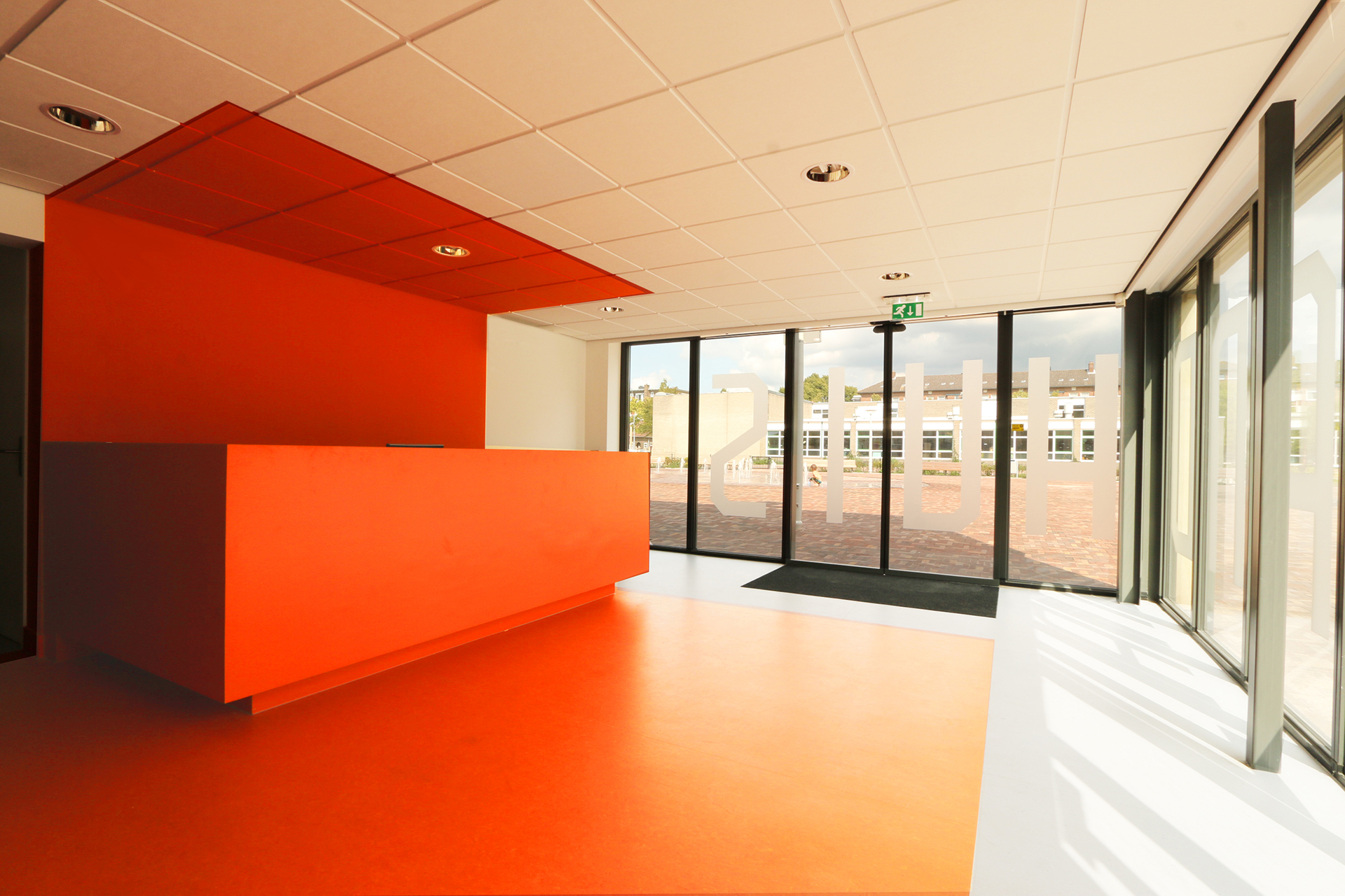
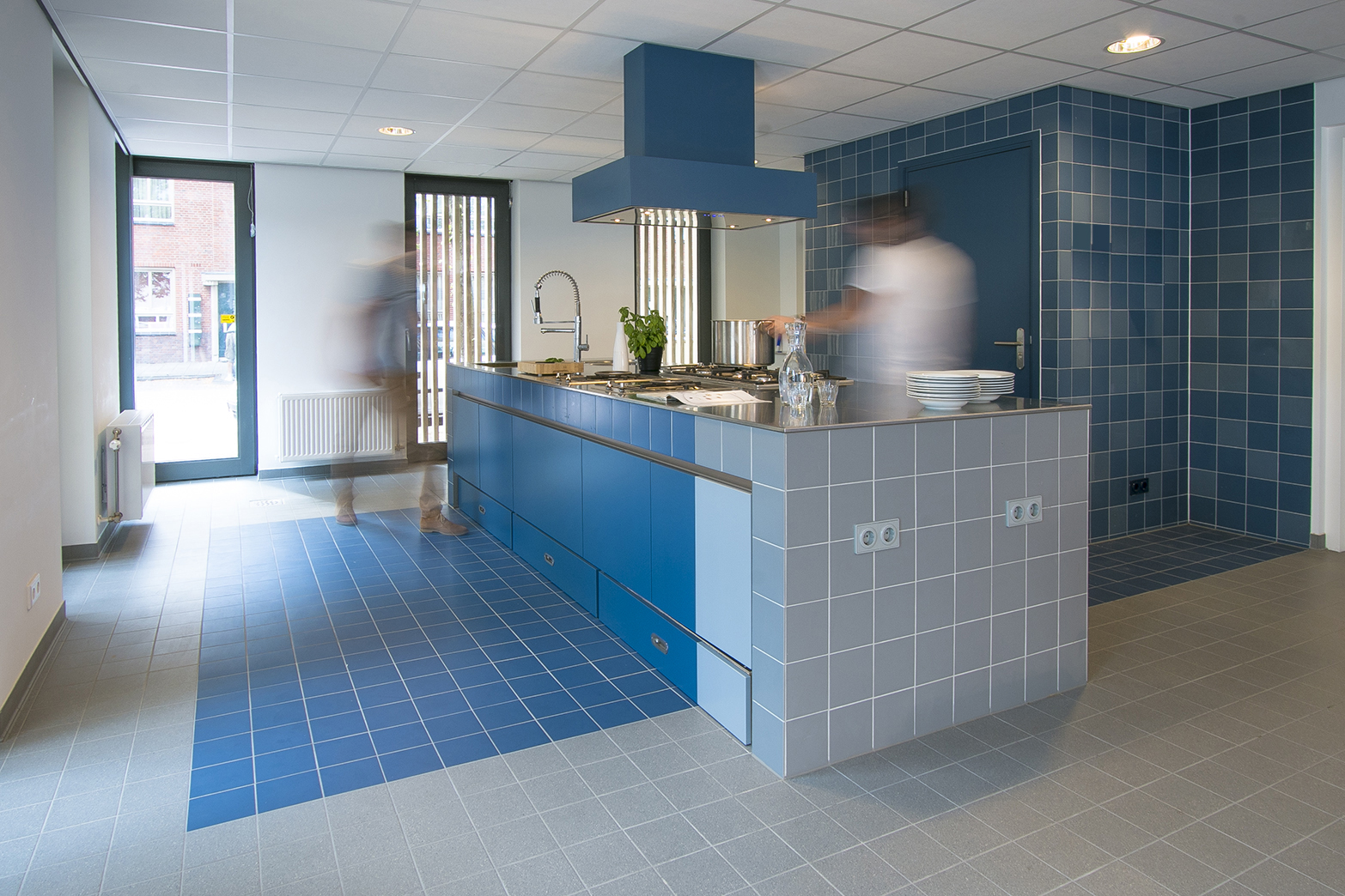
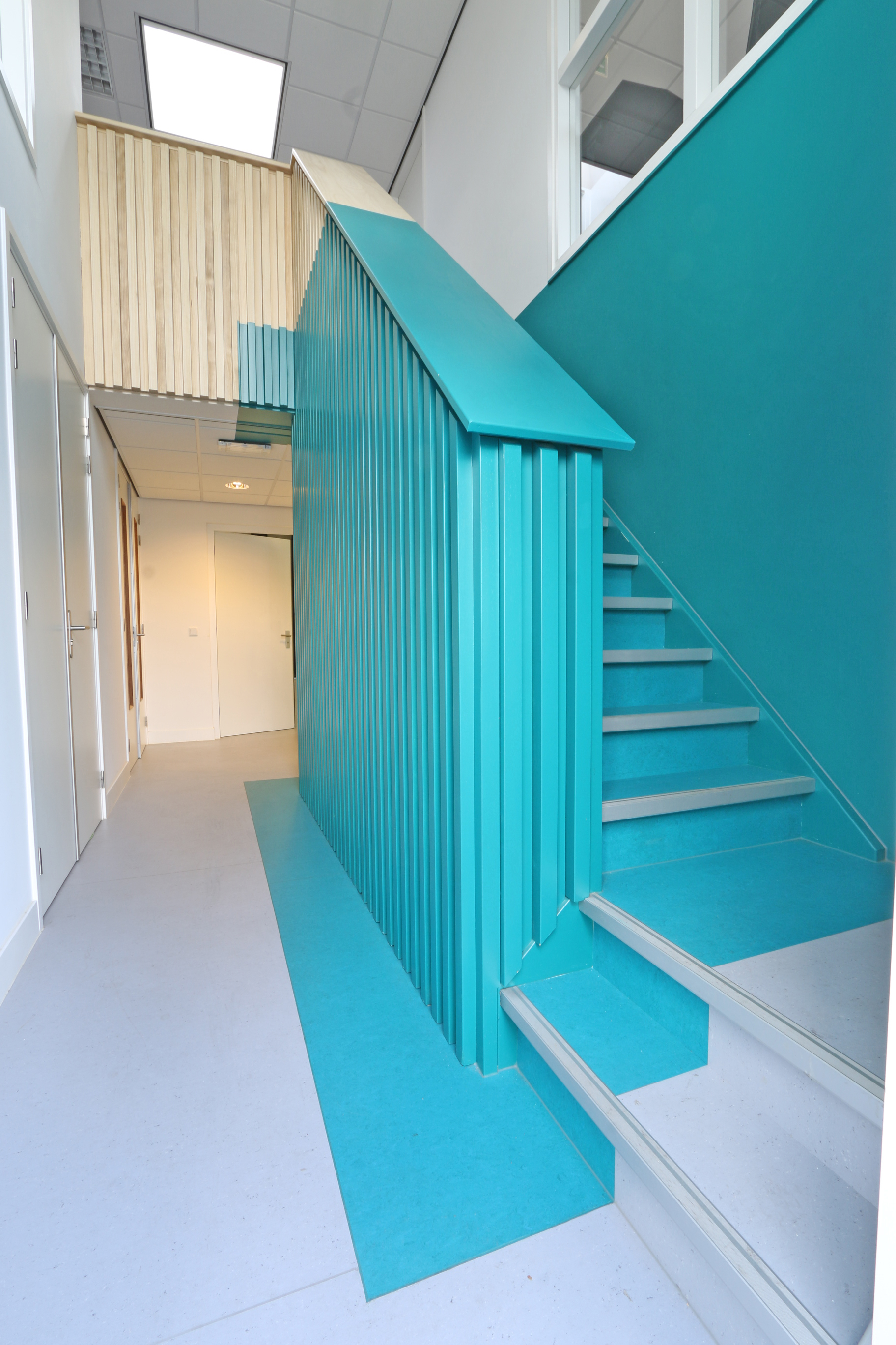
“Patches of color highlight the fixed furniture.”

Credits